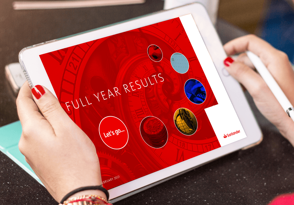

Every quarter, Santander roll out their financial results to the whole organisation to inform them of the trends and changes across the business.
But the team didn’t want this to be the same old, boring fact sheet with numbers on it. They wanted people to read, understand and act upon this information.
Santander wanted to shake up their results communications by helping their colleagues understand financial terms, bringing relevance to the numbers and making colleagues feel part of the big picture.

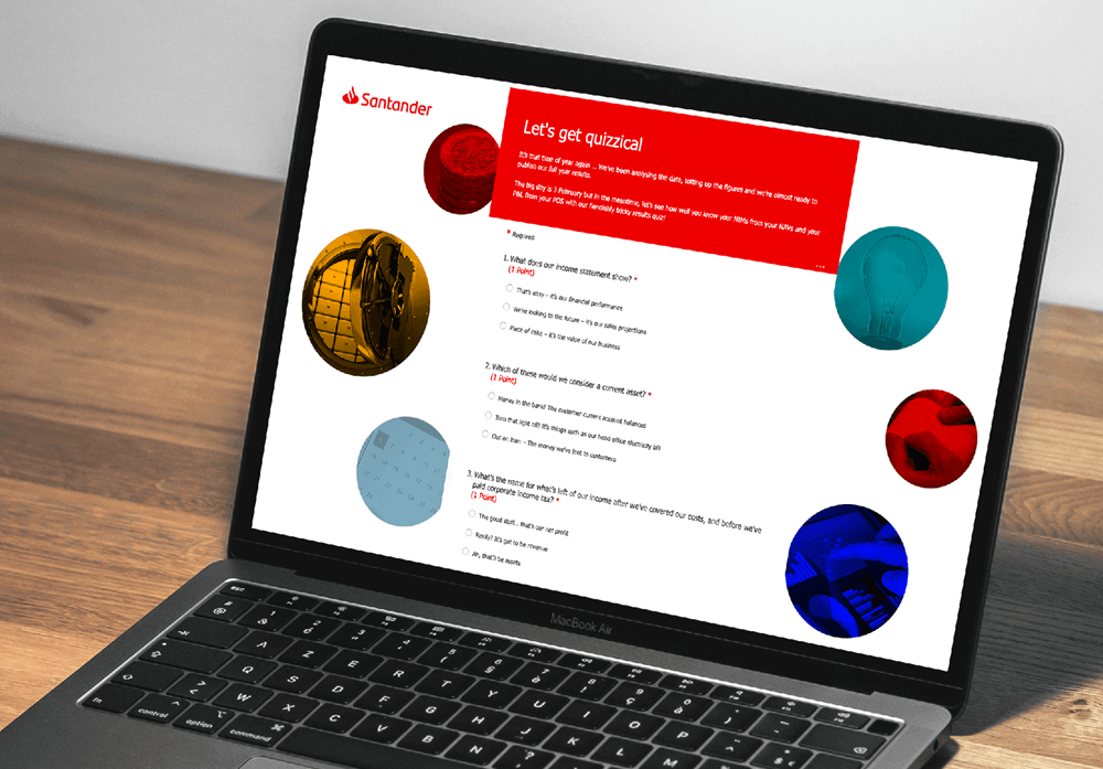
We created a jargon busting infographic to help colleagues make sense of complex words and financial terms; crafted a quiz filled with puns and short, snappy questions to engage colleagues and inject some fun into (what can be) quite a dry topic; and supported the bank’s results webcast, which was broadcast live across the organisation.
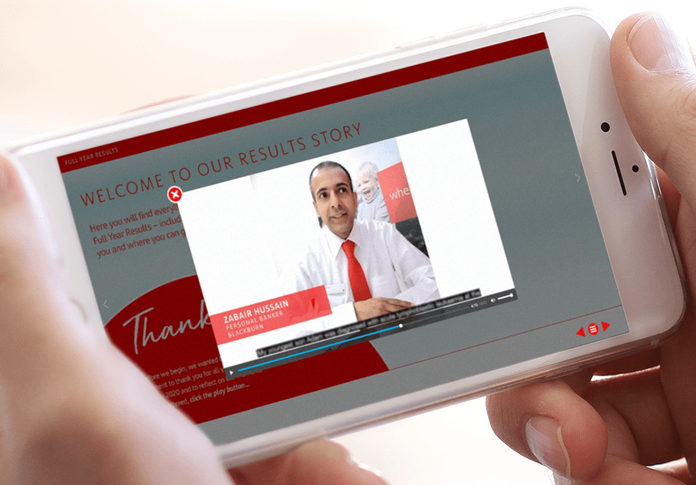
After the webcast, we launched a dynamic PDF to those who might have missed the live event. The interactive document was filled with leader articles, links to the infographic and quiz, videos, all the results and information on where people could find out more.

