When whisky makers, Chivas Brothers, launched a new vision, it needed an updated look and feel that would match its ambitious goals.
But this wasn’t just a corporate rebrand. The new look had to reflect the company’s future-facing vision, its commitment to its craft and its Scottish roots.
Who better to help than a trusted partner who knows the Chivas Brothers ethos, and brand, inside out?
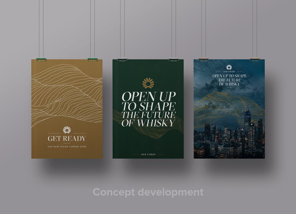
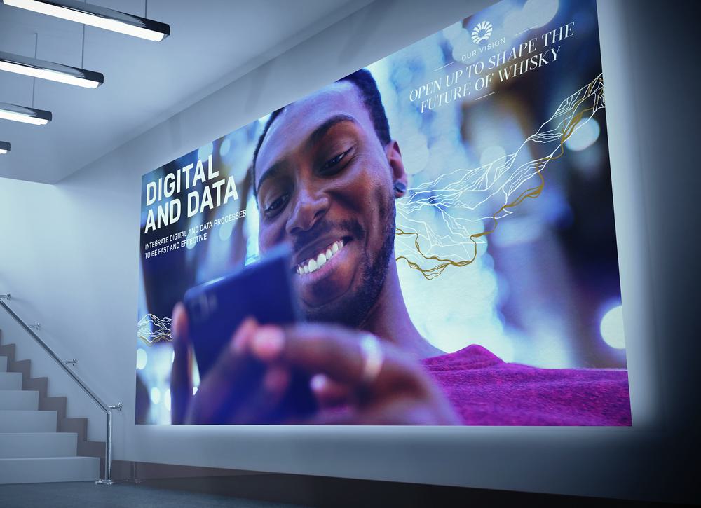
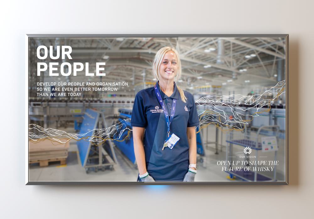
With the launch of a new vision, Chivas Brothers staked its claim as the distiller that wanted to push the boundaries of Scotch: opening up to shape the future of whisky. And it needed a look and feel that would follow suit.
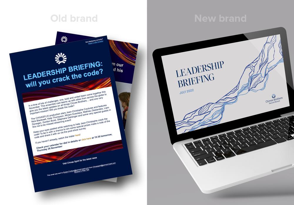
The existing brand had been in use for a while and needed a boost. As the company’s trusted creative partner, we jumped at the chance to develop a new, modern brand that would carry the business into 2024 and beyond.
We had a clear starting point for the new brand: something that would reflect Scotland’s rugged landscape and the water that’s so vital to its whiskies.
We wanted to make something truly bespoke, so we commissioned artist Claudine O’Sullivan to create a unique artwork that would be the centrepiece for the new brand.
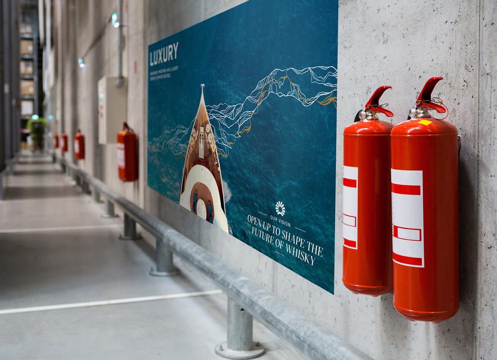
With a clear brief and regular check-ins from our design team, Claudine created a beautiful, contoured drawing that reflected the Scottish hills that surround Chivas Brothers’ sites and the water that runs through them.
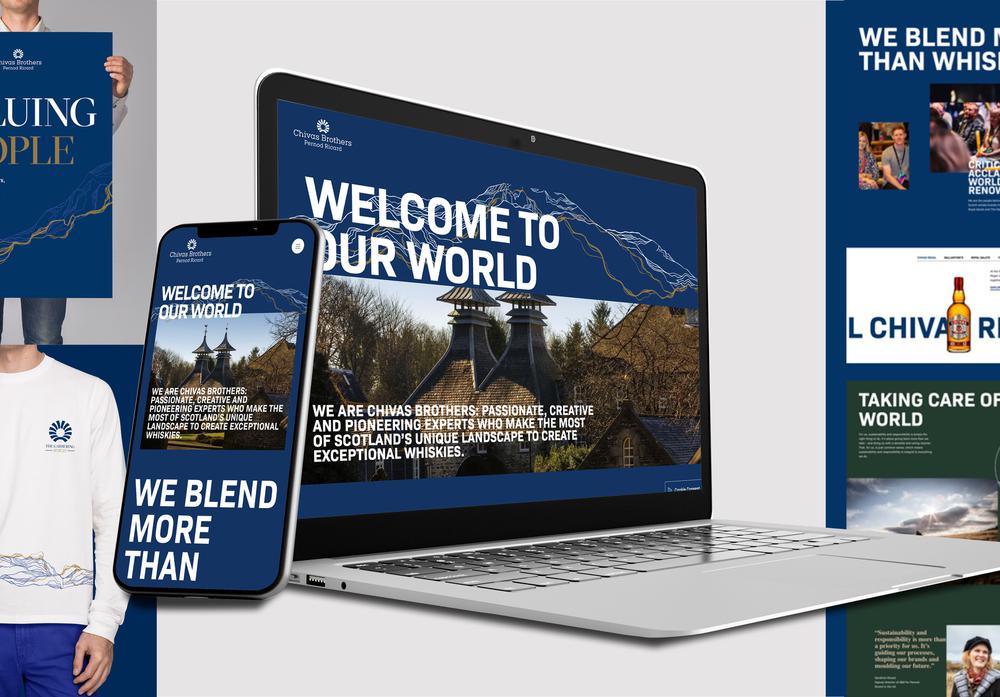
We then had to make the hero ‘contour’ design applicable to day-to-day use. So, we created a set of comprehensive brand guidelines showing how the contour could be manipulated and adapted. The colour palette we built felt like the Chivas Brothers so many know and love but fresher and cleaner.
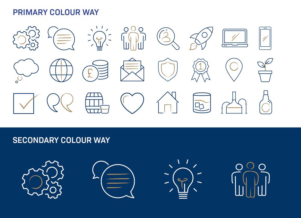
But we didn’t stop there: we created a raft of additional assets, including icons, Poppulo banners and templates for PowerPoint and Word, to truly embed the new brand across the business.
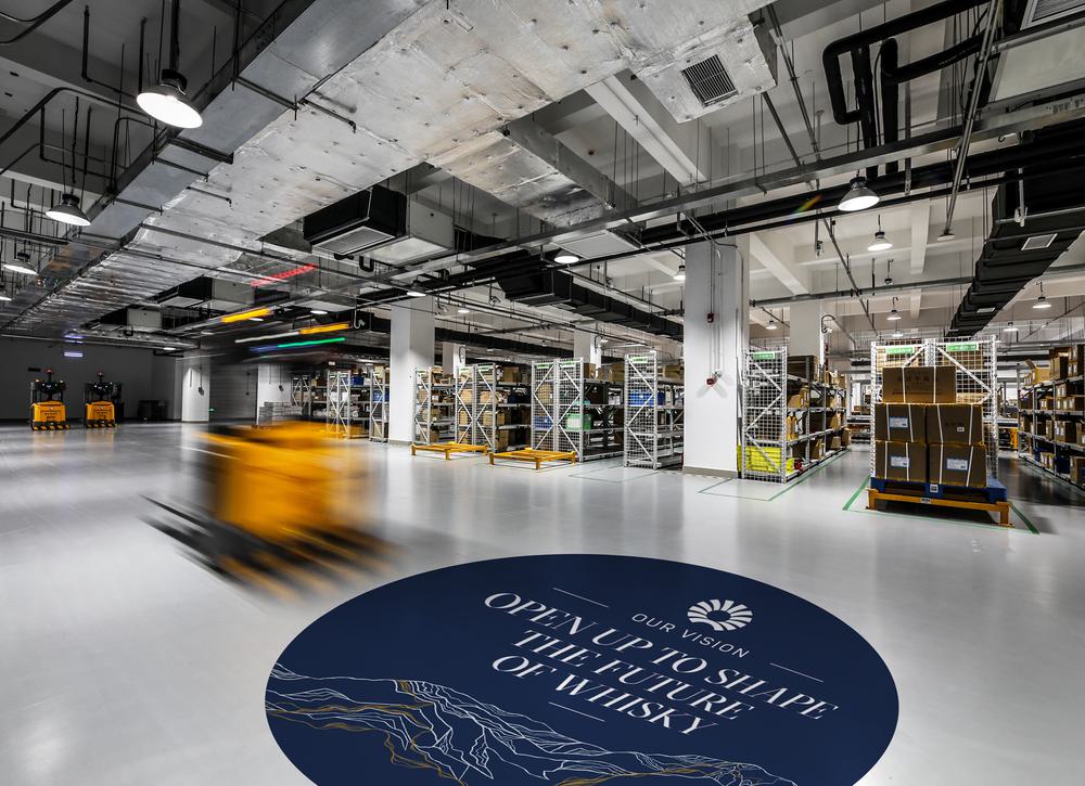
The result speaks for itself: a fresh visual identity that communicates who Chivas Brothers are, what they do and what they stand for. But much more than that, this rebrand has given teammates a strong and consistent visual theme to be used internally and externally.
Brand guidelines, banners, documents, slides, icons – the resources we created for them fit together to create a sense of continuity across all communications, one that’s consistent with the brand and their forward-thinking vision for the future.
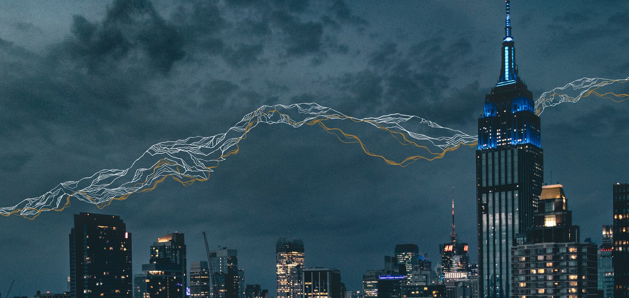
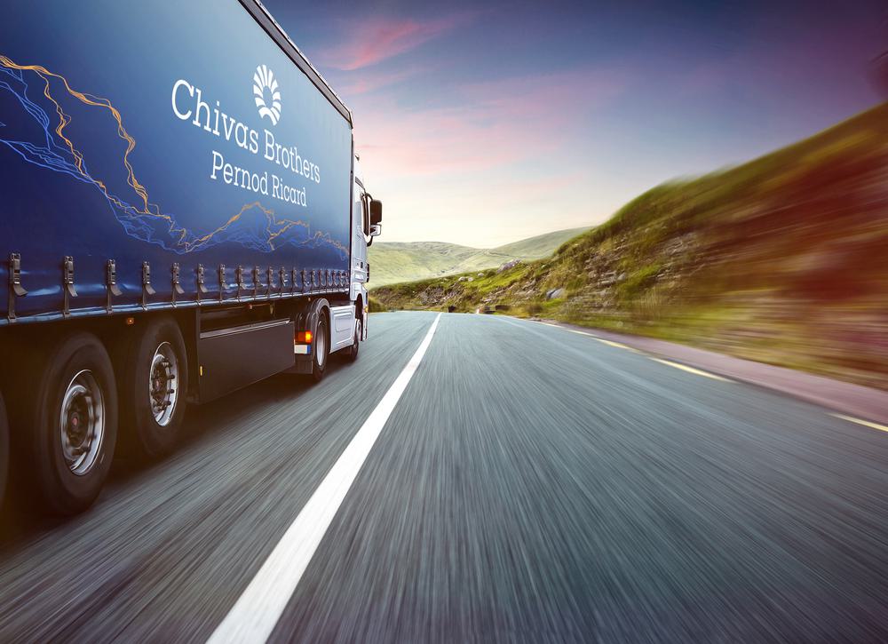
And our work made its mark externally, being broadcast loud and clear on socials, used liberally across the company’s new website and even gaining headlines when the contour was splashed across Chivas Brothers newest truck – Scotland’s first electric HGV.