HSBC’s We Are Not an Island campaign ran into controversy, accused of prodding our nation’s most exposed and sensitive nerve: Brexit. But what can IC professionals learn from its approach?
Having lived in London for years, I miss the marketplace of graphic design, advertising, messages and sheer creativity that hits you on every street corner. I remember the campaigns that worked – and the ones that didn’t.
Not long ago, I walked through a tunnel at Kings Cross that had been completely decorated – floor, walls and ceiling – in floral, herbal wood-cut etchings to advertise a gin distillery’s latest offering. I remember that the tunnel and I know the design lifted my mood, but I couldn’t tell you the name of the gin, or the distillery.
But HSBC’s We Are Not an Island campaign – created by ad agency Wunderman Thompson’s – did anchor the message to the brand for me.
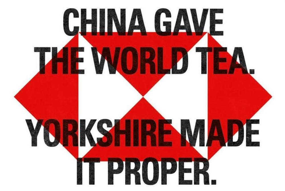
The well-considered, targeted, guerrilla-style graphics felt apocalyptic and dystopian. Those repeated slogans in striking black and red felt like an immediate alert, accompanied by bio-hazard warning graphics which actually turned out to be the HSBC logo. It felt like a warning or a call to arms – it felt edgy.
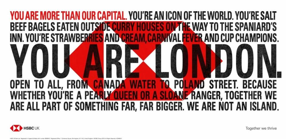
Beyond the visuals I read warm and humorous words that spoke of multicultural Britain and our gigantic melting pot of glorious influences.
The corporate giant denied it was delivering anti-Brexit messaging. In fact, a spokesperson was forced to explain it’s more about being open and connected to the world.
But was the propaganda-esque look and feel deliberately designed to act in direct juxtaposition to the warm messaging, or to stir the senses into revolt?
This guerrilla approach wasn’t just for London types, either. Localised versions adorned billboards in other cities too. For me, those attention-grabbing graphics made me feel proud to be British, while still reminding me of our international heritage.
The bank, in a big sweep of a broad paint brush, brought to light how British communities have been influenced by the world, and I salute them for the message and the approach.
What can we in IC take from such a punchy – and controversial – campaign?
Dixons Carphone case study
At scarlettabbott, we helped our client Dixons Carphone take a similar approach when it launched its vision, We Help Everyone Enjoy Amazing Technology.
That was the simple, single message and the client had a limited time to get it across to its colleagues. The answer? A bold graphic approach, delivered guerrilla-style, with banners and posters plastered all over the workplaces in a slick overnight operation.
It was a big success: there was no way could the teams miss those big, blocky letters, taking a bold stance everywhere they looked.
But for our Senior IC Consultant, Russ Norton, the power in both these campaigns lies in the words, more than the graphics.
“There’s a huge piece of empathy here – building pride through emotive language.
“Both campaigns highlight the fundamental brilliance of the message and building empathy triggers oxytocin, the ‘giving hormone’. People are more likely to give to charity if they make an emotional connection to the human it benefits. These campaigns apply that theory to trigger an emotion in the reader; one that makes them more likely to take action.”
Our Lead Behavioural Scientist Lindsay Kohler agrees:
“The use of the bold graphics is interesting. In general, that – and the biohazard-like HSBC logo – would elicit a fear response. We start looking at something as an existential threat of sorts and feel like we have little to no control over what’s happening.
“Combining that with the positive messaging that you see on the ads is a really interesting juxtaposition of emotion. That probably explains the mixed reception to the campaign.”
Your IC messages might not have to fight for attention in a London street corner, but in a busy work world, we still need to make sure the important communications hit home.
So consider a bold, pared down approach, linked with an unexpectedly warm message. Remember controversy isn’t necessarily a bad thing: if it gets people talking, it’s cleared the first hurdle.