Sustainability roadmaps are the metaphorical satnav businesses are following to achieve their environmental and social pledges. But how can you draw a clear route to your sustainability goals and avoid the long and winding roads?
We’ve all heard the endless “net zero”, “cutting carbon” and “green investment” pledges coming from every corner of every industry.
They’re great, but these promises are empty if they don’t result in meaningful, positive outcomes.
And to achieve those outcomes, every employee, regardless of job title, needs to play a part. Without your people, you simply won’t meet your ambitions.
Enter, the sustainability roadmap: the blueprint for making meaningful change. They’re a depiction of your plan and a tool to communicate that plan.
But how can we make sure these roadmaps remain a robust compass to drive down emissions and create a fairer society rather than becoming just another pretty picture?
Dusty old Word docs are out and beautifully packaged, digital, responsive documents are in. Plans that colleagues can feed into will help them understand where you’re going and how their actions make a difference, while making them feel part of an active team moving towards a cleaner, fairer future.
A few favourites
To show you just how mighty a map can be, we’ve curated a few of our favourites that are accessible to everyone, and asked our design team to share their thoughts about why they work so well.
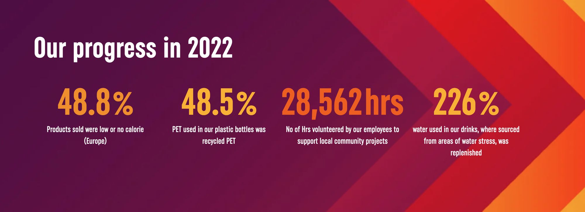
Firstly, we have this example from Coca-Cola Europacific Partners. In it, the beverage bottling giant lays out an in-depth plan and the actions required to execute it via six key social and environmental topics.
Our senior creative, Jonny Gatenby says: “It may have a lot of text but it’s presented well. The content is split into key topics making it easy to follow and further reading and downloads are signposted. It’s a far cry from your doddering Word doc that remains firmly closed.”
Softening a serious subject
Sometimes your people won’t wade through a text-heavy document. What do you do? Well, multinational food and drink manufacturer, Nestlé worked it out for their carbon roadmap.
In an in-depth downloadable report it lays out how it plans to reach its net zero goal by 2050 – doing it with both style and sensitivity.
Jonny explains: “You can tell they’ve thought long and hard about how to present their ambitions and messages. A playful illustration style adds a softer tone to the serious subject matter while interactivity on the contents page offers easy navigation for consumers.”
Time to get creative
What if you want to share information with time-poor colleagues who just want to know the next stage if your grand plan? Well, maybe it’s time to get creative like Brew Dog.
These hard-hitting graphics – coupled with punchy copy – wouldn’t look out of place printed and plastered on a wall; they loudly broadcast key information but also make up a larger, 25-page report detailing the brewer’s sustainability goals and a looking back at its green journey so far.
“It’s bold and fun design,” says Jonny. “It conveys the detail everyone needs while staying true the recognisable brand and style.”
The infographic took pride of place on their website not only reaching colleagues but also keeping consumers updated – showing the world how they’re putting their money where their mouth is.
Mapping your road
When it comes to keeping colleagues, customers and communities updated and onboard with your ESG efforts, long, wordy reports won’t cut it. What you need is all of the details, tailored to your audiences and wrapped up in one perfect package – just like these examples.
Taking inspiration from the best of what’s available online can help your sustainability communications but remember, your approach should be unapologetically and authentically you. This is a chance to empower, engage and enliven colleagues, so they can play their part in delivering your sustainability targets – don’t miss out.
If you’re looking to engage people in your carbon reduction efforts, get in touch, we can help.


