
David McCandless, data journalist, information designer and founder of the visual blog Information Is Beautiful.
I couldn’t agree more. The world is an impatient place. Cutting through is a challenge, not least in internal communications where we’re battling against limited time, limited interest and a whole host of other unconscious biases from our audiences.
I love information. I’ve a thirst for it and I’m constantly on the lookout for my next hit. But I’ve seen an evolution in how we consume data and our expectations around how it should be presented. Shortened attention spans, competition for our eyeballs, smart phones, social media and the rise of the citizen journalist mean we’re never far from our next information fix, but we’re busy. With this in mind, grasping an instant overview of what’s happening has never been more important.
It’s easy to get lost in streams of numbers and mountains of content, whether you’re creating it or reading it. As creatives, we can filter out the noise and lift up what we want our readers to focus on by mapping out and visualising the information like a landscape. The clearer the map, the easier it is for the brain to find its way around, digest and, even better, want to explore.
Creatively, we do this in two ways. The first is through data visualisation and the second is the more commonly known ‘infographic’.
Knowing when to use which is key to getting that all-important cut-through.
Data visualisations are visual representations of data, abstracted into an easy-to-process form. The information is clearly displayed and stripped of unnecessary commentary, allowing you to draw your own conclusions. They’re best for reports, dashboards and in editorials.
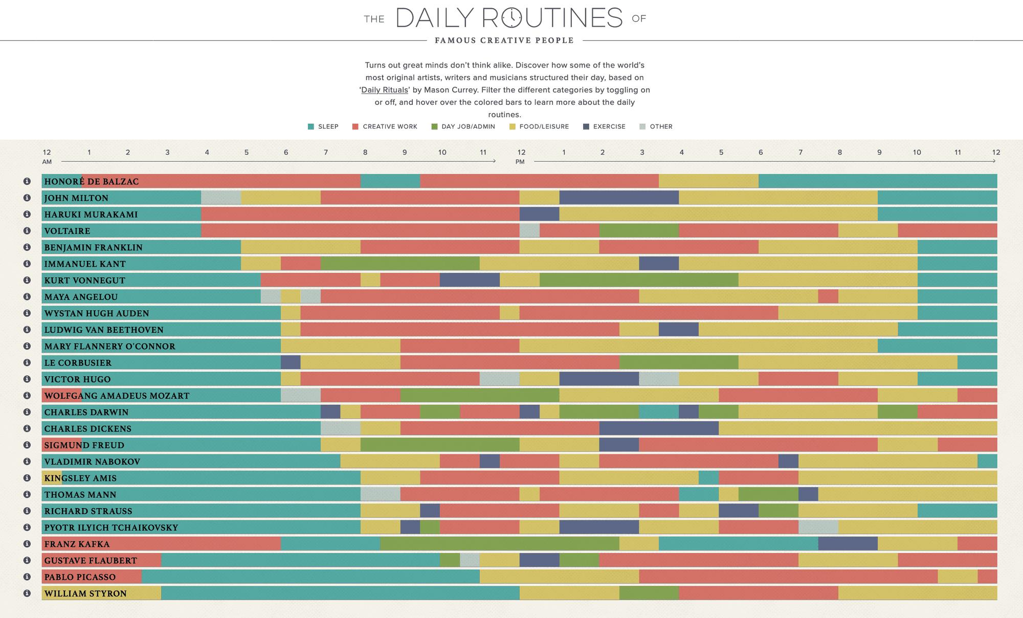
Infographics are visual representations of facts, events or numbers that reflect patterns and are all about telling a story and guiding the reader to pre-conceived conclusions. They’re ideal for case studies, blog posts and using over social media where they invite conversation and sharing. An infographic can contain data visualisation, but it won’t work the other way around.

Bring your business data to life
Done well, presenting data in your organisation can be a powerful way to get people talking and aid understanding of complex information. But it depends on your goals and the data you want to share. Results of employee surveys, audits, financial results and gender pay gaps are just some of the types of data-rich content that benefit from being brought to life visually.
Whether you choose data visualisation or an infographic, here are some essential design principles to help elevate the information.
Are you looking for inspiration for beautiful data visualisation? Let’s talk about bringing your facts and figures to life.